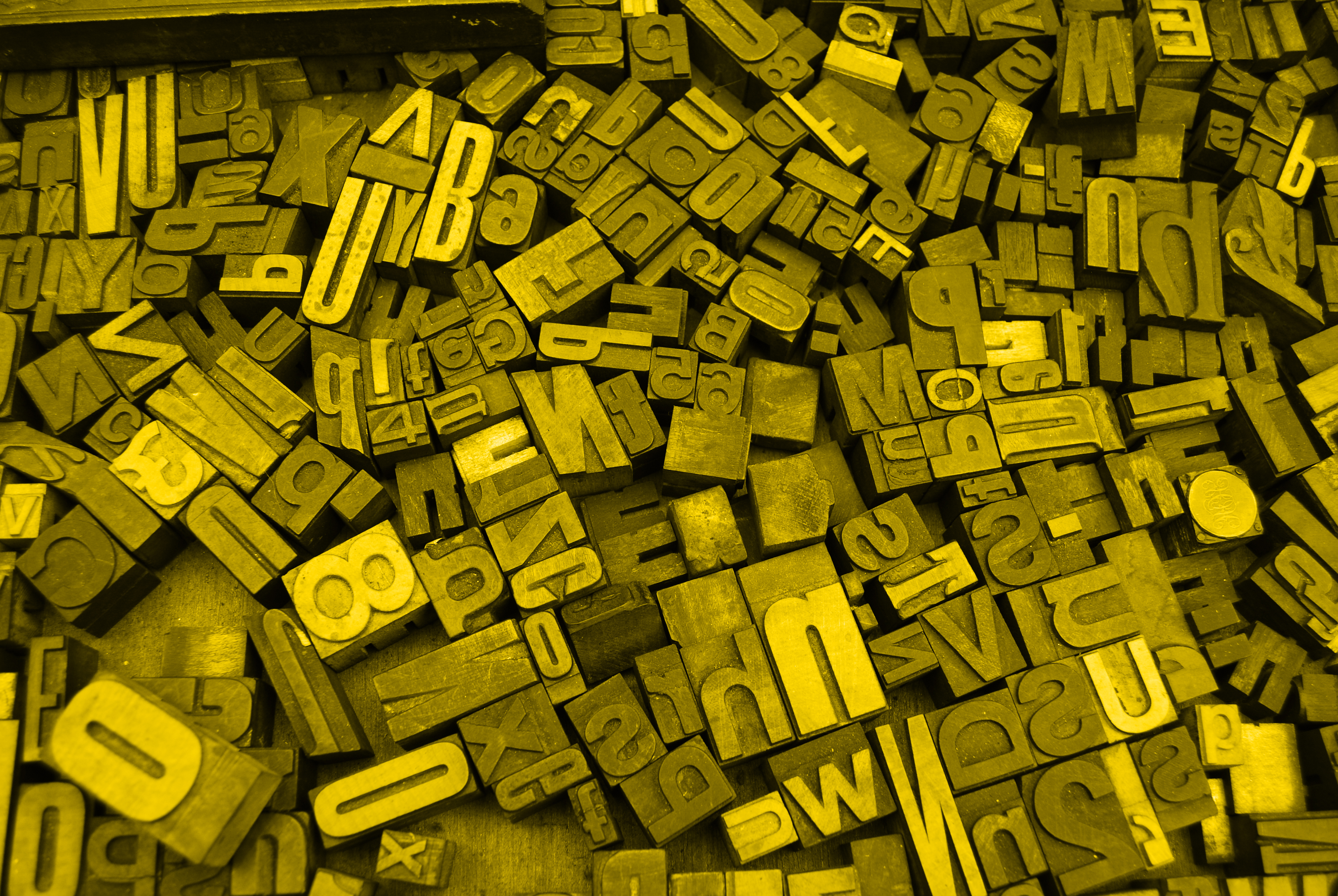
Design trends and their caveats (part 2) - Bad font decisions
designFontstypographytypefaces
After having talked about a literally moving topic like Parallax effects in web design it is time to pay attention to typefaces in part 2. In general typefaces are a very opinionated thing to discuss but I will keep it to the facts (isn’t that what everybody claims to do?) as good as possible.
Play fair on your reader’s eyes
The heading is no coincidence. Playfair is a great font to make a bold statement. It comes in very distinc shapes and especially the scrip/italic version is very luscious and full of wonderful curves and curls. Typefaces like these are being used a lot these days because they break with the boredom emerging from the over and over appearing Open Sans and Roboto. Add a few hundred typefaces inspired by calligraphy to the mix and the web does not feel like 1999 anymore at all. And this month there will be another 100 new fonts available. By the way: We are discussing typefaces when talking about the design and look, but it is a font when I am talking about the file, the digital incarnation of this typeface.
The thing with many designers though is that the increased use of such lucious fonts often times results in a frenzy of overdosing websites with these fonts. They are being used everywhere. Unfortunately that leads to a Playfair fatigue and many other fonts suffer from the same tsunami of uses. That is no bad thing in general, but it is less than perfect when you do not reflect whether the usage of this particular font is actually the best way to go. I have seen sports websites using Playfair where it made no sense at all. Not even in the most creative way imaginable. So please think before you dive into the Google webfonts vault.
It pays to have a well educated font choice executed on the website. And do not get me wrong, I was one of the first to jump on the band waggon when David Carson emerged from the surf and started going wild on his Mac. But what it taught me was that not every chaos is the same. I started learning why some things need to be the way which they are by throwing myself into mayhem and climbing back out of it.
Random reading rule rejection
Sounds a bit like a disease, doesn’t it? It kind of is. I am surprised over and over again when it comes to typography on the web why so many websites, and especially themes and templates available for sale, are suffering from such poor typography. The worst is probably the superlongrunninglinesyndrome (this is no typo but to bring my point across): Text uses 1400px in width to be thrown in front of the reader. No matter what you tweak in terms of line-height or font-size, it will be insulting to the reader. It is physically impossible for us humans to read such long lines of text. Applying for the Art Director job at Chameleon’s Weekly you might be a top condidate, but nowhere else. There are many rules one should learn in design school explaining what to do to create good and readable type, if you are uncertain what to pay attention to it might be a great idea to visit Typewolf’s Typography Checklist.
Too wide, too bulky, too display, too aliased, too thin
When choosing typefaces and implementing the fonts it pays to test them: The combination of the fonts, as well as the way they render. Is there a bold version, or do you have to have a faux bold which often times looks like … well I save you the description. Are you in need of italics? Are there any available? What about small CAPS? Make sure you have the fonts available if you need them at some time later on. When the combination of headline, decorative and copy text fonts fits, ensure that great readability of the typefaces is ensured. Let other people look at demos. The webfont specimen might help you with that. It pays to take breaks when working on the fonts as well. We designers often times sit there for hours and loose ourselves in the details. Stepping away from the computer helps a lot to get a fresh look at your work again. The devil is in the details, yes, but it is possible to hide things in the open, just like we make mistakes and they are so obvious that we do not spot them when looking at them all the time.
Retina vs. Retina
Attention, here comes a common pitfall: Retina devices! I have met so many designers not checking their work on other machines and devices. Here they are with their shiny Macbook Pros and Retina displays, their high density iPhone screens and everything is great. And yes the client likes it as well on their Samsung S7. But what about the rest of the users/readers/visitors to the site? What is the type like when being looked at at the not so uncommon Windows 7 machine from hell with IE9 and the not-so-Retina-screen? Oh dear Lord, is that a poor quality all too often. And only when the site launches people start to notice because the feedback comes in from the real people. Get yourself a really crappy external display and check your fonmt rendering on a screen coming straight out of hell. Please. Thank you on behalf of every future visitor.
Würden sie Fréderic beißen? – Umlauts, accents, slavic languages, …
There are many awesome fonts out there but please make sure they cover all glyphs which are needed. Some even miss a Euro sign. Simple thing, but unfortunately it needs mentioning.
Contrast and letter-spacing
When you buy a book on typography some things apply to print design but not to screen design. But whatever you might read, and again the typography checklist is a good idea to consider buying, it makes sense to check the result in terms of readability, again!
Those small font sizes you are using in the footer might actually be more readable when you have a bit of letter-spacing injected into the text. The headlines in those huge 5em heights feel to loose and might like some tightening. The line height in general might be at a 1.1 and would love to be presented at 1.45 or something similar. Please get some demos up (the webfont specimen is great for being hacked) and try the details on different screens and with different settings. For all sake, try the fonts in the browser, not in Photoshop or Sketch.
Loading times: Hey Veneer, I am looking at you!
I have been working on a project where webfonts were generated via fontsquirrel’s webfont generator (please consider a donation if you ever use it!) and the webfonts came out at 1.3 MB per font. A font like Veneer simply has way too many details. This makes the size inflate far beyond the acceptable limits. Please make sure your load times are in a range where visiting your site does not feel like downloading the latest OS update. Google offers you a visual gauge indicating how many fonts are acceptable and how many are not. And to make sure I did not leave Veneer standing in the cold: The webfont version you can buy is way smaller: They took out many of the details which even a retina screen cannot show anyway. So the webfont is a bit less detailed, but it is 15× smaller. And guess what you will barely notice this below 970 rem ;)
You rock!
I love the fact that you have placed a few things on your mental or physical to-do list and want to pay more attention to the typefaces and the way their fonts render in the future, no matter whether you are a designer or someone hiring a designer. The web will be so much nicer and your site in particular. Let me know when it is ready. No seriously let me know!
The next thing I would love to invite you to read about is about frameworks. They help us a lot in moving fast, but we tend to loose a few things when embarking on a framework ride when not being careful.