From hero to zero - tales from above the fold
designRWDheroresponsive webdesign
It is no secret: Heroes are everywhere. In Marvel films, in comic books, in newspapers, and yes, on websites. The huge images with a bit of text on them. So are they serving website owners well in their function as super heroes?
Who doesn’t like a good hero?
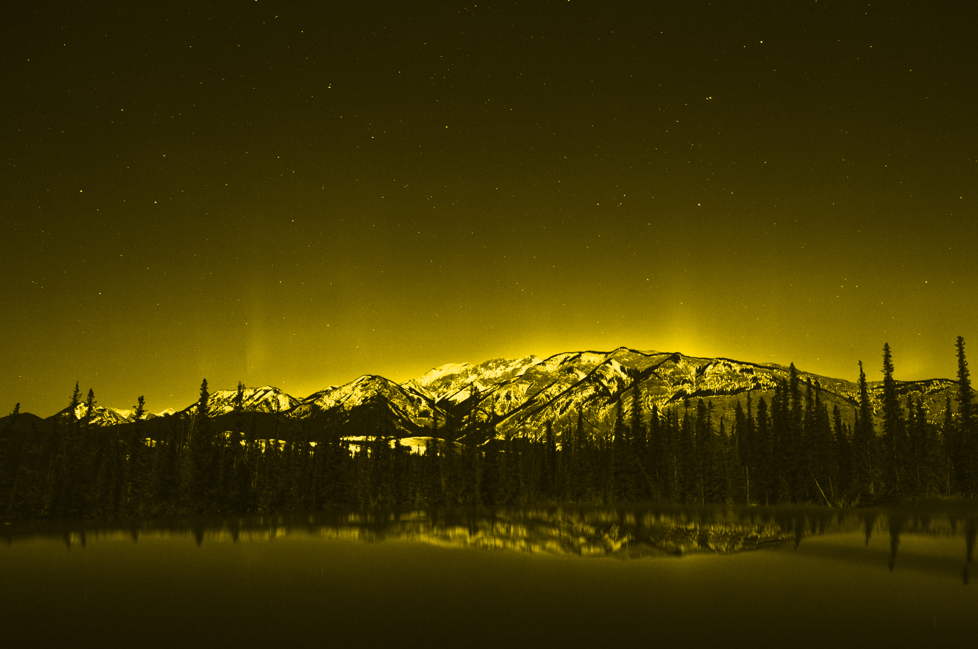
They are everywhere indeed. Since the first ones popped up a few years ago, these mega large images opening up a website and greeting you, the reader, with impressive stock photos of mountains and roads in a slightlz subdued vintage look. Or with a bold saturated product shot. All of that mixed with a catchy headline or mission statement, sometimes with the obligatory ‘hi, my name is X and I am a webdesigner’.
I guess we all have a picture in front of our inner eye. By the way, this very website is no difference. And that is no excuse or justification for these heroes. Quite the contrary: I need to change this.
The good (and beautiful big picture)
To be honest with you, even though I might sound a bit ironic in the previous paragraphs, I love a great photo, think that a good mission statement or clear communication of what a website is about. This is what you get with the heroes.
Unfortunately not every solution performs well at showing the imagery or the text. Quite often the photo is drowned behind a dark layer or hidden by strong parallax effects. That does not serve the image well, but often times makes the text readable.
In other cases the images are beautifully presented in full colour and all their details but the text is barely readable in fromz of the image. In an age of responsive websites and layouts using images to cover a hero area it is seldom to know exactly where text will be positioned on the photo.
The bad (a.k.a. where can we improve things)
In addition to the aforementioned problems with text readability and photos darkened to an unrecognisable texture there are more things to worry about as a website owner.
Some sites fail to communicate that there is more to the homepage than the hero or the good old ‘above the fold’ area. You get to the page and think: ‘Great, that looks okay. Thanks. Bye.’ Ooops, nobody saw your blog, your other products, your whatever you are doing on the site. Indicating that there is more by showing at least a little arrow or something alike would be a great idea. The other option is to not cover the full height. 90% might serve you just as well and indicate that there is more than the big stage at the top.
Blame it on the theme
As I mentioned earlier on I am guilty of many things I am writing about. It is mainly due to the fact that I am using a ready-made template for the blog. I thought to myself that it is better to start writing than building a site first. That is the case for many people I guess. A lot of them do not even have the chance or capabilities to have a theme build for themselves and have to resort to the ones you can buy on themeforest or similar sites. But that means the responsibility is shifted to theme authors to some extent.
When you build a theme and it is used by thousands of people it is your responsibility to make sure the theme follows best practises. If that means you have to teach the people buying your theme how to deal with images and text or settings for your theme in order to get the best out of you should do so. Do not rely on your fancy demo and sell as much as possible, but make sure you are not clogging the web with obese data transfers.
Responsive, but responsible please
But the responsibility is not just on the theme developers/designers side alone. In case you have one of these heroes on your site, or maybe even many like I do, it is a great idea to think about the usefulness in small viewport sizes. Do you really need the image as a background on the smartphone when it is and 87% are covered up by the text anyway? Probably not. And while we are at it: If you should really need it to communicate your message why not serving a smaller version for the smaller screens. So, you need an image? Move it to the top and put the headline underneath the image on the smartphone. That way people have a chance to actually see it.
Cropping, ratios, and the need for more bleed difference
As mentioned above there are many themes and websites out there using images in a good and responsible way. People crafting the most advanced responsive sites are actually paying a lot of time to how images should behave and where virtual cropping takes place. A great moment to pledge for more developer/designer interaction when it comes to developing these modules (read more about that on uiengineering.de).
When you are not in the position to change the templates and the behaviour it is your duty to check whether your images are fine on all different kinds of devices. Ask yourself and check this:
- Does the image look good on smartphone, tablet, and desktops?
- Do I need to have the focus point of the image on either side or rather dead centered?
- Should I scale or crop the image when the device viewport is changing?
- Does the text reside on areas later on which make it readable?
Play nice and save your readers some download time
If you cannot change anything about your website, or as an additional measure if you can, it is a great idea to save your images at decent file-sizes. Many content management systems work on the images anyway, recompressing them, rendering smaller versions etc. but it is a great idea to save your original 12 mega pixel photo at a small file size. You can compress it fairly hard (10-20% is often good enough) because it will most likely be squeezed to a smaller size anyway. And when that happens you do not see the artefacts anymore. This can easily shrink your hero images from 1 or 2 MB down to 0.1 MB (100 kB). That is a huge difference! Go the extra step and save your readers some time and bandwidth. Hey, and Google likes that as well.
Things to do
Personally I have to get to the theme and setup of my site and blog as well. I am guilty of doing many of the things mentioned above, and I am anything but proud of it. If you can do any of the things I mentioned above go ahead and make your site even better. In case you have purchased a theme or site design, go and ask the developers and designers to improve them. Feel free to point them to this article.
Hope this helps you to make your site even better. Happy optimising!