Help! I am drowning in brush script fonts!
letteringScriptfontsBrushscript
A few posts ago I was writing about the problems one can run into with design asset bundles. These bundles, as I explained back then, cover many different areas or bring you vast amounts of the same or nearly the same fonts, Photoshop Actions, Lightroom filters, icons, you name it.
Same same but different: Brush scripts
One thing really does become apparent when looking at the current font charts and what is on sale: Brush Scripts are the latest fashion it seems. I have purchased vast amounts of these fonts during the last 12 to 18 months. Not that I actually wanted them except for one or two, but I got them with the aforementioned bundles.
Now of course when you look at these fonts in detail and inspect the details of the letters, ligatures and their flow you do notice all the differences, even when you are not an experienced font expert. And as with every font there is a use case out there. Some of the demo images which the authors create do show some nice applications.
However the sheer amount of brush scripts are beyond manageable. I did a quick rundown through the bundles from last year and counted some 70+ fonts of these. All of them different but I could barely imagine any real use case in my daily work. Well that is not the fonts' fault of course but I am surprised about the flood of these fonts being published every day.
Production cost for brush script fonts is lower
Compared to other fonts, like a solid sans-serif or a classic serif, a brush script font can be produced quickly and with imperfections. The base is often a good set of letters - glyphs drawn on paper. scanning these and fine-tuning them a bit to work as a font is way easier than actually drawing a font from scratch and making it a well-working piece of software and aesthetics. The inaccuracies of the hand-drawn shapes are most likely what you are willing to accept, actually it might be something you are aiming for. The more distorted and destroyed some letters are, the more authentic the result coming from your laser printer later on.
Hail OpenType!
The great thing about OpenType is that it offers many features beyond what people have come to expect: You can randomise glyphs being output, add calculations, make letters twist and wiggle, merge them in different ways. All of that is fairly playful, but can be turned into a great set of choices to enhance handwriting, lettering, and brush-script fonts. A bit of randomness is what makes these forms of typesetting "real". For that reason it is a pity that many fonts do not make use of it. But then again, these might only be produced for a quick buck.
Additional Glyphs for decoration but …
Many authors spend a little extra time to get more into the fonts. Filler words like "and", "new", "sale", etc. are added for the users' convenience and because they fit well into many design concepts where such scripts are being used. Unfortunately this is about all of what is added. Not seldom one is looking for umlauts and accents in vain. I would love to see more of these in the quick and easy productions. After all my native tongue is German and it needs these umlauts.
Trend scouts, tell me what's coming up?
I am wondering what the next thing will be after this flood of brush scripts. There is no end to the tsunami of them coming in so far, but most designers and even some clients must get sick of them already. Is the pendulum swinging back towards extremely engineered fonts next? Making Helvetica and DIN look like flourished pieces af artistic work? Probably that goes a bit beyond a reasonable scenarios but there will be some of that effect I guess. We will see it very soon.
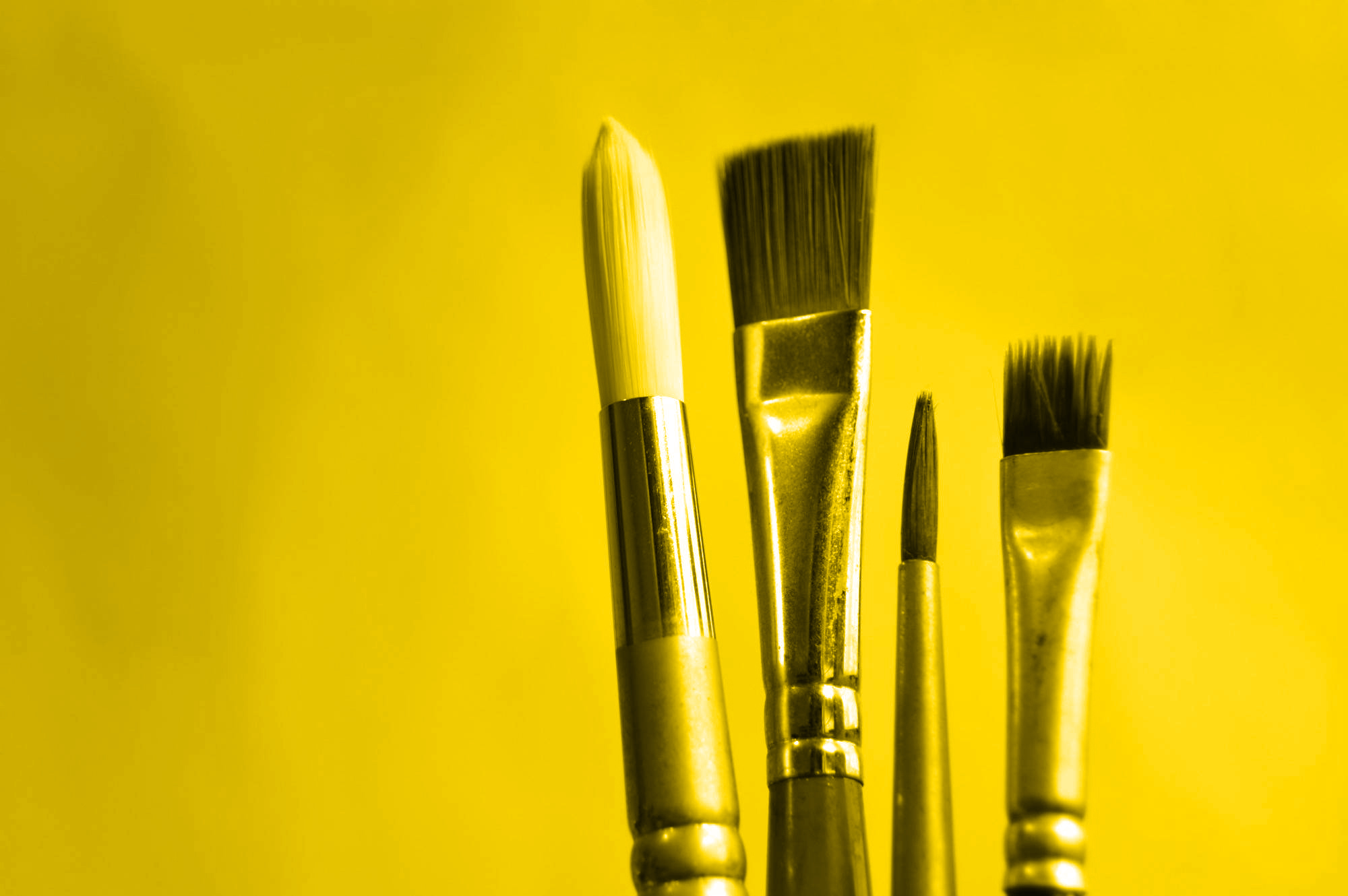
Get your hands on a real brush
It is convenient to use the aforementioned scripts as a font. But I urge every designer, blogger, and greeting card producer: Get a real brush and lettering tools. Get your hands on real paper, real ink, real dirt and scratches. It is so much more satisfying than just loading up a font. The beauty of hand-writing and lettering can barely be reproduced. You get there 80% of the way with a good font, but after a little practice the real monty is the thing you want. There will be more imperfections more randomness and often times a better flow. Try it for yourself, it will pay off!
Summing up
I am happy to see the lettering art coming forward. People are starting to appreciate hand-made things again. Yay! But instead of making the quick choice to use a font I will start resorting to real drawing and lettering for now. By the way: Finding the right font is not as quick as I would love to see it happening either. But talking about the state of font management is a topic for another day.