Why designers and frond-end developers should talk more often
collaborationdesignstyleguidesfront-enddevelopment
Learnings from 3 years of working on major shop relaunches
Try walking in my shoes
Imagine you are a designer
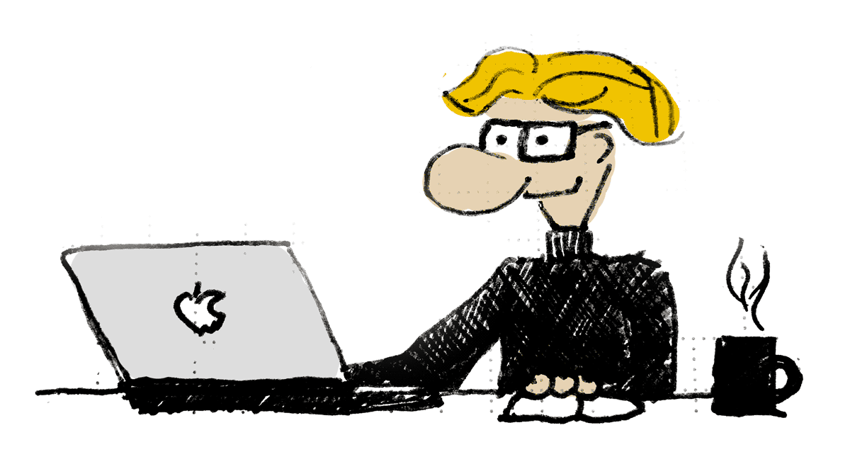
Here is a typical situation designers come across: They have carefully designed and crafted layouts, polished buttons, took care of shadows and many other tiny details. After these designs were sent to the developers it took some time and today is the day: The layout is presented in the browser! But what is that? The details are lost or completely different from the designs and some things are not even there. „We were not able to get this developed.“ is the simply comment. #WTF
Imagine you are a front-end developer
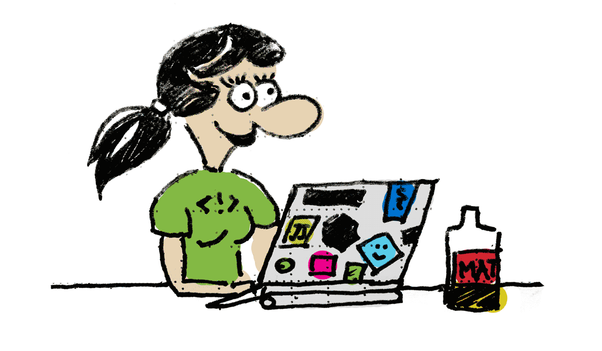
Today you start on the new project and the designs have been worked on for ages now. But what you get in the mail must be a joke: The file homepage_2_final-new-updated-FINAL.jpg is everything but a feasible web-design. Thank you very much design team. When will you start to understand how this internet thing actually works? But you are motivated and make the impossible true and deliver on time and get everything done like in the layouts. But what do you get? A mockup of the original layout at 50% transparency layered on top of a screenshot of IE6 with all differences highlighted. In addition to that the words that make your day: „Did you even look at the layouts before creating this?“ #WTF
Cracks in the team’s spirit
This is not a healthy setup. In case you are either a developer or a designer this has probably happened to you before. But it is a situation we all laugh and/or bitch about in order to deal with our annoyance. We hate this – to the bone. So for teams to work efficiently this is not a feasible situation. And it does not matter whether this is a virtual team casted from different companies, or a „real“ team inside a corporation or agency. It hurts and sucks all your positive energy away.
So you are doing completely different things … not
Designers
Designers are trying to arrange things, make users’ eyes follow a certain path, help users to identify things, define the layout’s style, and communicate values while doing so.
Developers
Developers write documents, give structure to elements, make these elements behave in a certain fashion, add machine-readability, and, hell yeah, they make stuff fast.
Apples or pears, or just fruit?
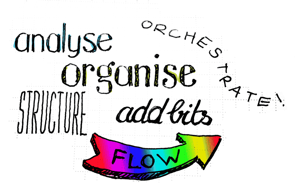
Both groups are essentially doing very similar things:
- analysing
- organising
- structuring
- adding visual style or meta data
- defining flows both visual and functional
- orchestrate all of the above
It is of importance that you understand that the underlaying similarity of what both trades are doing is the basis of a common ground, the root of a better team-work. It is the different treatment and understanding as well as the way solutions are being approached which can cause misunderstanding.
Where exactly are similarities between design and front-end development
Developers use mixins in their CSS/SASS/SCSS/Stylus/… (I’ll refer to it as SCSS for simplicity reasons from now on, for brevity reasons, not based on preferences. Designers use consistent visual elements which are similar but not identical.
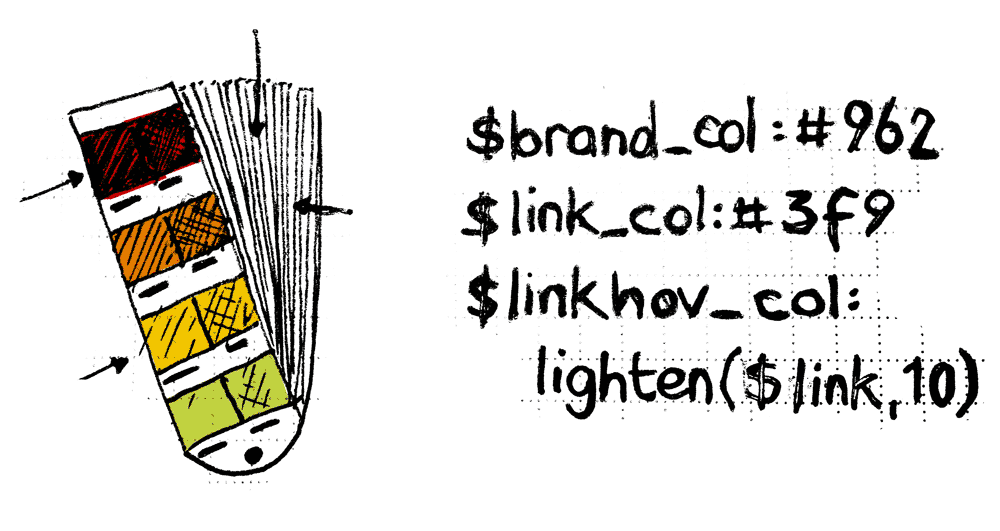
Developers use variables for spacing, padding, colours, whereas designers use tool presets or style formats for consistent type sizes, colour palettes, and visual appearance.
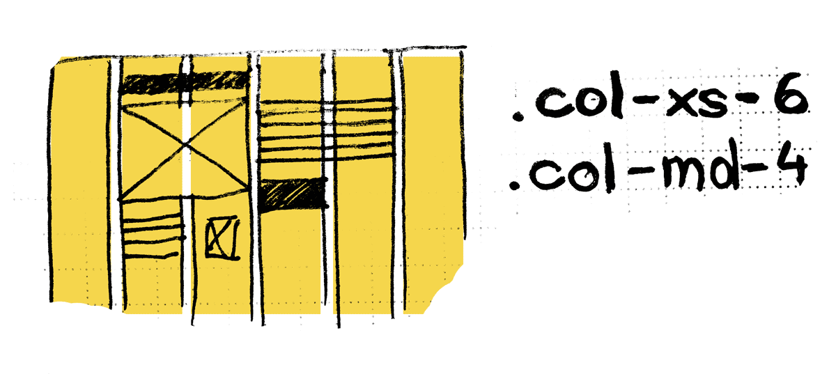
Developers use grids, so do designers (most of the time at least).
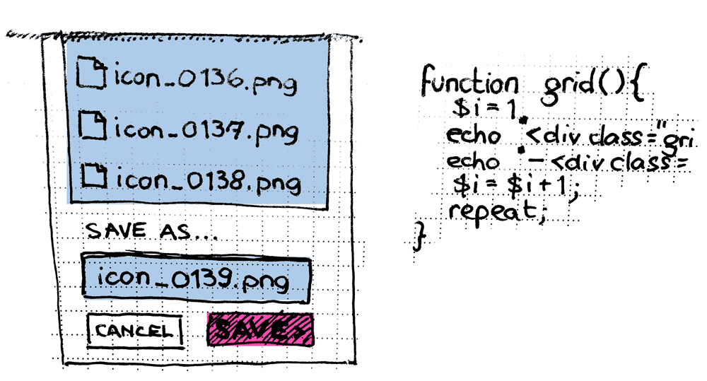
Developers write functions to avoid painstakingly repetitive tasks, designers have smart objects, slice-saving and Photoshop Actions.
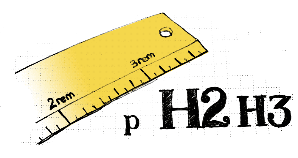
Developers hate to measure things in flat layout files, obscured by JPEG artefacts, designers hate the details being ignored or being overseen.
That, again, sounds like a lot of similarities.
Common ground: style guides, pattern libraries, or whatever you want to call it

So when there is such a basic similarity it is obvious that one should find a tool which caters towards both parties. Style guides, could be such a thing, and to mind are actually a great fit.
DISCLAIMER: Not the bloated, print or PDF style guides which are outdated the second they leave the printer, being border-line useless examples of TL;DR documents.
The fact that these cannot be sufficiently updated or „live“ in a single location and authority, but with every copy of the PDF there does exist a new entity which can not be kept up to date until someone replaces the file. But how should readers actually know that they look at an outdated copy without having to visit a website. Shouldn’t there be a website with the style guide in the first place then?
How can a style guide website be built?
So, if the idea of a style guide in a centralised location is great, and if, being a website, can be updated a lot simpler than a PDF, how can one go about it? What could we do and use to cater towards the needs and wishes of both designers, and developers, heck potentially even the whole team or company while we are at it?
A pattern library is a great starting point
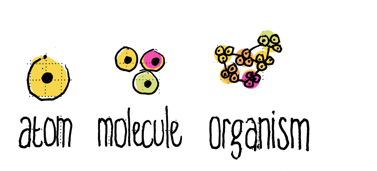
A modular / atomic design approach is a great starting point. In case you are not familiar with the idea I urge you to go and read all about it over at patternlab.io.
The idea of creating a pattern library is not new anymore but it is well worth mentioning since it is a great tool for many parties to collaborate, especially our two parties „at war“.
Next up conceptual work and basic version
Since the early days of people creating websites, content developers or concept developers have sketched and kicked of the process of getting sites online. Well, surprise, essentially that has not changed. Without a plan you do not need to get started after all.
But here comes the change: Now it is well worth considering to have the developers take over those ideas. They could start setting up the basic markup and build up the pattern library as well as all the connected services like deployment pipelines, tests etc. We’ll get to that a bit later.
Style tiles to get the design started
„But what about the designers?“ I hear you scream? Don’t worry, there is enough work and potential to excel for everyone in this newer approach. Designers could start to create style-tiles. There is an extensive description and templates for you designers to read and download at styletil.es. The great thing about using style-tiles is that you, as a designer, can focus on the discovery of the general style. You do not have to worry about the details of links and Buttons, the organisational structure of a navigation and it’s responsive behaviour or whatever one could think of. You just focus on the style. The cool thing about that is the fact that you do not steer into shallow water with the stake holders for the design because you named a link wrong or have a rough idea of a logo placement which could easily hijack the whole process of discussing the design. Well, we have all been to meetings like that where some extraordinary smart person cannot concentrate on the things on the agenda and get distracted. Hey, design is one of the few things on the planet (together with being the football coach of one’s national team, and being a politician) which everyone can do after all.
Many agencies and teams still work with the designers first setup. This is still happening everywhere, just like people still using fax machines. Go figure … but seriously. I think there are reasons for designers to start first, but there are many projects and situations where the above mentioned process is way smarter. Hey, and when you have a tight deadline there might actually be no way around it because this gives your developers a head start. You might not be in the position to have them wait for the first final designs to surface.
So, with the danger of distracted stake holders almost entirely taken out of the equation, the discovery of the design process can get started. And chances are a lot higher that people focus on the general appeal rather than details which are of no interest as of that point in time.
Are the developers the new designers?
So if designers do not come first, how can we actually design things? We are given everything pretty much in a final state! All the atoms, molecules, and organisms are done by the time the designers get to them.
Really? No! You still have to get the basics right. The developers create a plain vanilla solution. Without styling (as far as that is possible as you cannot not style something). That basic styling should not take that long anymore. Actually it is a great process to verify things from the ground up coming from the atomic level. You still have to decide and verify what a link looks like. Only because it is underlined and blue, does not mean, that it needs to be that way. Your job is not replaced, but someone carved out the rough shape for you already. You have to make it look mighty pretty, slick, awesome, fresh, or whatever the intentions are.
So when you are faster getting this basic styling out of the way, especially with all the style tiles to use as another support to get that task done, guess what: More time to focus on the real challenges. Work on sophisticated layout grids, how things behave across breakpoints when they are complex, etc. Is that not the thing you really want to do? Working on something great and demanding opposed to just typing dummy copy in Photoshop over and over again? See, that is what I thought.
A „new“ responsibility
Developers pay attention now: After years of bitching and moaning about being the last one in the process of creating things (and quite rightfully so, not being the last, but the bitching about it) you got promoted from the guys „in the basement“ who never get things right, to the folks in charge of the projects fundamental setup and production processes.
That is a huge responsibility and burden I know. All of a sudden people say you are the important ones. Heck, yes you are, and you secretly have been the real makers ever since. Now everything is depending on your work, how you have set things up, how far ahead you have planned, and how flexible your system is. But as long as you fill others in to your ideas and concepts (the designers / UX people), the more questions you ask and educate yourself the more this load can be distributed, the responsibility split.
All aboard the team train
Make your work everyone’s business, make them care, make them own it, make them be proud of it. It is their product as well. How can you get them to be part of that style guide? Get them to contribute. Listen to their needs and ideas as well.
A shared style guide: a water cooler everyone loves to hang out at
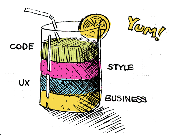
So if the style guide is supposed to be a product which everyone loves and feels like cherishing what needs to be done and what are the necessities for it to be loved?
Documentation for everyone and every aspect
The documentation for everyone and every aspect of an element, be it just a link or a complex process navigation, must be nearby. This involves code, design, UX, and business aspects since people do not know what to use and why. But keep it short and precise: People need to get it as quickly as possible. TL;DR is the main problem with the old, bad style guides.
„living style guide“ as in, no-dead-screenshots
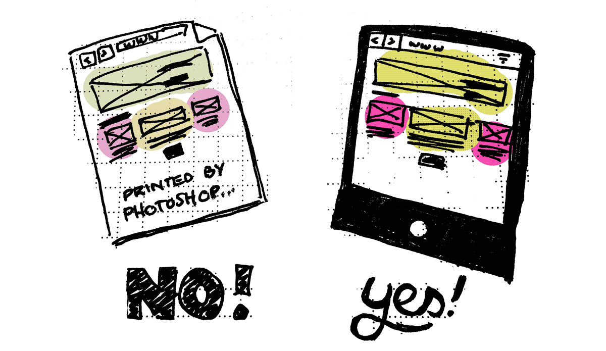
Only the „real stuff“! One should see the actual, current version of everything in the style guide. As soon as there is a delta between the style guide and your real website people will not rely on it anymore. PSDs, PNGs, etc. are only assets to continue development, not the actual documentation of your front-end. And the great thing is: You can actually see things on all devices, which helps you to test and therefore avoid surprises.
Educate
People will love to find everything in the style guide. But maybe you need to introduce them to it when it is a large one. People will not explore it by themselves because they do not know what to expect.
Fresh and updated – no discussion
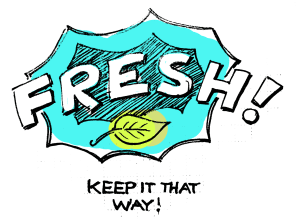
The team needs to keep everything up to date or you loose the power of the tool. It is like a well: The whole village will gladly come to get their water supplies, but only until the water smells and is polluted. There is no use in a style guide which leaves the readers/users with questions only because it contains contradictory, or outdated information, or is simply missing the information at all. Make it a routine to keep the information fresh and up to date.
How can we improve design and front-end developer collaboration?
What do the parties need to bring to the table to improve a) the workflow and b) the level of sanity for each member of the team?
- Open-mindedness helps a lot in this process: Both parties need to move from their current position and closer to the „other side“ to be able to understand what their reasons and values are in order to get the project done.
- Joy to learn things and willingness to team-work are no-brainers but for completeness sake I do mention this. You never know.
- The will to improve, both personally and efficiency-wise.
With these things in mind let’s get to the things I believe to be of importance for the situation to improve. A disclaimer up-front: There is no group which needs to move more than the other, no attitude worse or better than the other, there is only one common goal: A smoothly operating team with members who do love their jobs.
What do designers need to do
- Get off your high horse!
You might think you are doing awesome work and that is true. But without the rest of the team your stuff remains a dead PNG file. - Explain what you are doing and why!
When the rest understands your decisions it is easier for them to work in the interest of your concept. When your work behaves like a free radical particle, you will get cancerous results back from the implementation team. - Stop fearing code!
You design for the web, stop ignoring what the web is build with. Cooks know everything about ingredients and so should you. Johannes King, a 2-star Michelin chef makes new cooks in his restaurant learn how to fish and help with the harvest in the garden. You should know your ingredients as well in order to start creating great things and not just Mac’n’cheese style sites and apps. So go and learn the basics. Jessica Hische has created a starting point for you with the great domain name dontfeartheinternet.com - Stop being sloppy and messy in your work.
Define rules and stick to them. Exceptions are rules as well, and just like salt in the food some exceptions make your designs special whereas too many make things disgraceful - Talk to the team!
The guys with stickers on their laptops and t-shirts with prints you do not understand that is. They only bite when they think that you are making their days miserable, actually they do not bite, but they might bitch, just like you can when someone makes your days a burden. - Standards save you time
Understand, that the work you invest in standards will give you more runway later on when you want to spend time on the details and exceptions. - Plan ahead
Stuff can go south and people change their minds. Just be prepared and join forces with the others who would be affected potentially. - Use Terminal and the web inspector
Open the Terminal (Mac: Apps > Utilities > Terminal) and change the colours so it does not scare you anymore. Pink keeps many people away, almost better than a lock screen ;). Learn to live in the browser, right-click and Inspect. It might even be fun to change „the internet“. Do not worry: You can’t break things from there.
What do developers need to do
- Get off your high horse!
Same thing as for the designers. - Explain what you are doing and why!
It does not hurt to fill people in to what you are doing. The more they learn about your job the better they can react to your requirements. - Prepare structures and offer tools to get designs delivered to you as you need them.
If possible lower the barrier of entry to your world. The more you open the gates to your tool chain the fewer things will break while entering your world. - Ask and explain why things are different from the norm.
The thing is that this helps others to understand your problems and tasks even better. - Get basic shit working and make it fast and fun
The quicker you have the first things up and running the more people will be motivated because they see things come to live. They will gladly help to shape it. - Offer insights into what can be done.
You want to do the fancy stuff? Show what you can do, which options are on the table and again, explain why it is fancy and what it is really good for (remember: designers tend to choose eye candy over solid, simply-working things sometimes. Do not lead them astray!) - Plan ahead
Just like the designers you might be confronted with last-minute changes to your work. Try to keep flexible as long as possible.
A day in the life of the perfect team
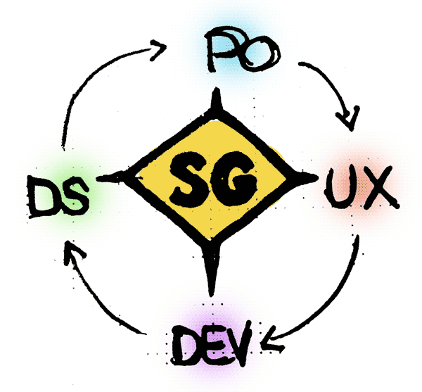
With all the preparation done so far I guess a quick run-down of the work might make sense. With the style guide concepts can be created by using the modules and building blocks at hand. Maybe even as a static mockup by copying code snippets into a new document (the designer’s sandbox). Great, that could be super fast and one can immediately see what it feels like in the browser on different devices.
Developers build stuff based on the standard design or just a „vanilla version“. After that the designers get the chance to review and fine-tune. They can test by writing CSS, or maybe just playing around in the inspector. sometimes that might be enough to change the design to get to a great product. And it is soon easy to communicate a few lines of CSS, trust me.
And there will be no time wasted by building the same stuff, in different teams, in parallel / at the same time when you keep your style guide up to date. No one wants to waste time doing things which have been done already. So, eat your cereal with a fork if you will, but do not fork the workforce by generating tasks which have been done before.
Stylegen
At GALERIA Kaufhof I was part of the team to bring the new shop to life (it launched in 2015) and we developed a tool which goes by the name Stylegen, a generator for style guides. It is currently an alpha version but go and have a look at it or ask your developers to check it out for, or even better, with you. It is open-source and on Github.
The documentation for your styleguide can easily be done by writing markdown files. Markdown is simple and easy to pick up and so it should be a breeze for everyone on the team to get their share done without any problems.
The design can be changed by the designers, the tool by the developers, the documentation by everyone, including „business people“ and UX. A real team tool. Feel free to join the developer team …
More tools for style guides can be found over at styleguides.io.
Conclusion
I truly think that the quality of work can be dramatically improved if both designers and front-end developers move a bit closer towards each other. I have had the great opportunity to work with outstanding developers over the last few years. They have made it easy to wander into their terrain and I do hope I could give back where ever it was possible. We were able to achieve amazing results in short amounts of time and that is partly due to really working together as a team, sharing work and responsibilities. I hope you will be able to achieve such wonderful work constellations as well.
Thank you
- Dennis and
- Michael for enduring the pains of a designer trying to understand their trade and for repairing things that went nuclear even outside my sandbox
- Falk for sparing and many explainations during the stylegen creation process so far, and for taming my terminal
All the wonderful people at neuland, breuninger, GALERIA and everyone I forgot to mention here. Get in touch, I’d gladly link you here.
This blogpost is based on a talk I gave at the E-Commerce-Camp Jena 2016.
Image credits: All illustrations by Jan Persiel
