Design trends and their caveats (part 6) - Icons without cause
iconsdesignUX
Where ever you look, icons. Bold icons, tiny icons, icons on your home screen, icons on t-shirts, icons, icons, icons. People love icons, and so do designers. But how can we use them more appropriate?
Millions of icons
Today there are many icons and icon sets available. You can choose from a vast variety, some of the available for free (Fontawesome, Ionicons,Iconfinder etc.). Others can be purchased on market places like Creative Market or directly from designers like on picons.me.
But they all share one thing in common: They have a certain amount of icons, some are very versatile whereas others come strongly topic based. In some sets you can find hundreds or even thousands of icons whereas others only give you a set of 20-40 items to choose from.
Choose wisely
When it comes to choosing icons for a website/app/design it makes total sense to look at the design in detail. Just like a font which needs proper visual evaluation, so do the icons. Are they busy, sharp and spiky or rather smooth and rounded. Not every style fits a design obviously. But when choosing an icon set it is not as easy as choosing a typeface. The advantage of the fonts is to bring you roughly the same glyphs. Some carry more glyphs than others, bring fancy open-type features to the table … errr, desktop, but in general they all offer numbers and letters. But in an icon set it is pure luck to find the rocket which you want to use for your launch date count-down.
All of a sudden you are faced with the question: Shape or meaning/symbol? What is more important? And what makes things even more complicated: Maybe you need more icons in the future. Will they be in the set?
Thou shalt not mix
So there you are, having to decide between proper look and the right symbol representing the action/feature/etc. Well, taht is easy: Mix! Websites like the noun project offer an icon for every symbol imaginable. Just go and choose the right one … NOT!
While this is the easy fix and solves a problem for now, it does not solve it for good and with high design standards in mind. Doing so is basically not any different from setting something in Times New Roman and for a certain letter you switch over to Arial Bold. No one with a slight understanding for design principles would even dare thinking about this. But when it comes to icons this is something you see all over the place.
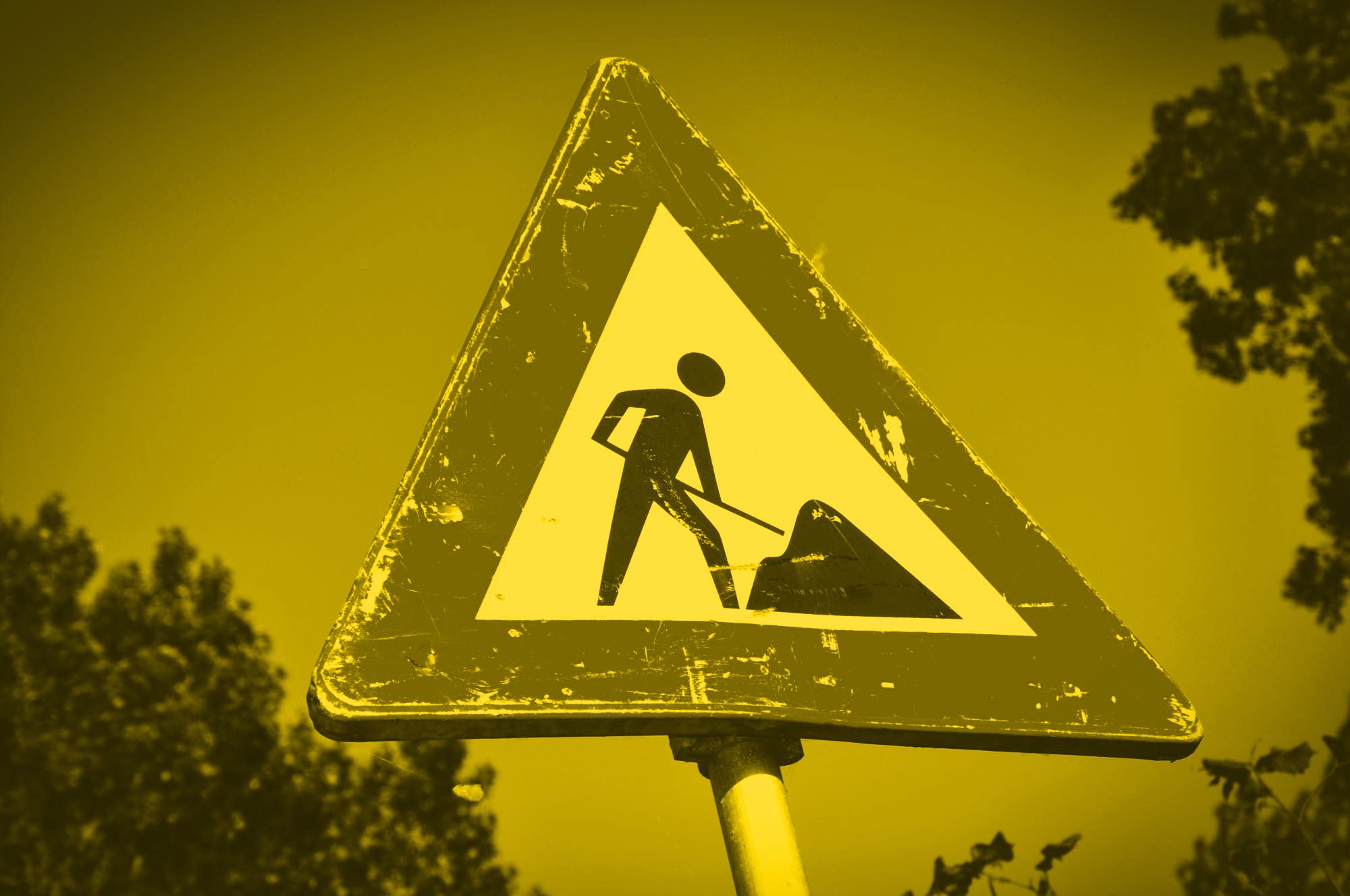
![]()
The reasons one should stay away from mixing icons are manyfold: Lines might be of different thickness, the curves and edges might be different, the general appearance and lightness can be different, Some icons are solely based on lines whereas others rely on fills or even colour fills. That can be one or a bunch of reasons not to mix icons from different sources.
Scale me not
But even when you design with a single source of icons it makes sense to still pay attention to scale. Often times there are UI relevant icons in use: chevrons, carets, arrows and similar symbols. These are often being used for links and interaction areas like tabs, pull-downs, popups or even buttons. Unfortunately many icon sets just offer one size of these symbols. So the little one inside the tiny button is scaled down to 12 × 12 pixels and in the slider the same one is used at 48 × 48 pixels. This results in a difference of line thickness of 400%. A little bit to much in most cases. So there is a strong reason for icon sets to offer different sizes of such symbols. Alternatively an iconset in light, regular and bold weight would fix this as well, but is more than rare. It is super rare.
Alternatively an icon set is available as an open format giving the user the chance to change line thickness. Free icon sets barely ever come in in such formats. The last icon set I purchased (Caviar Icons) came with both a fixed line width (outlined) version and an open version where one can change and modify the icons' line thickness. Well done, that is the way to go. The great thing about this is, that one can use CSS to control the line thickness.
Decipher me
Now, we have covered the visual aspect of icons to some extend, but what about the rest? The rest? Yes, the symbols themselves. Many people, and I have had clients like that as well, ask for icons to "make the site look modern and slick". They simply want some icons in there. There is no real reason, they often times just think, that it is a checkbox that needs to be ticked in order to be able to enter the cool website owner's club.
I would almost dare to bet that it takes you only a few clicks to find a website with icons used without any real purpose and/or with a completely weird icon selection. I am not talking about printer icons being used for fax numbers (which is not perfect but understandable), but rockets for just about every single thing one wants to communicate, or coffee mugs because … well I cannot explain many of those choices.
Font (not so) awesome
Do not get me wrong. I think fontawesome is a great idea and service and I have backed their hilarious kickstarter video and campaign but the readily available nature and the fact that every theme and template on the planet seems to use them has made the icons more than generic. And since there is only a limited set of symbols available (still loads compared to other sets) people simply choose something that fits 'kind of'. And that is the point where I personally think that things get lost in the process: First a generic icon set, used by everyone on the planet, then mediocre fit in terms of line thickness and no way of fixing that because the icons are not line-based. And last but not least picking symbols which only roughly explain what you need or want to show. How does that mix-and-not-match make a website special, modern and slick? It shouts out mediocracy from the roof tops at best.
Summing up
Icons are great. When properly designed they help understanding an interface, find your way around in an airport, make reading a manual a lot easier. But to benefit from icons all the way, one should choose the style and symbols very carefully. An icon is missing? Rather design it or have it designed with the same design principles as your chosen icon set and keep the consistency up. For that reason it makes sense to have access to the open base design files. So in case your designer is not the original designer anymore the work is still consistent with the original icon set.
Choose the right visuals and test them. When 2 out of 5 think that it makes only some sense to use the rocket as the symbol for speed do not use it. Your audience is so young that they have never seen a floppy disc? Do not choose a floppy disc icon for saving. And by the way, not for loading animations either ;)
When choosing an icon set think about the future as well. Is it extendable, are the formats only pixels, or vector? The vectors are what one wants and needs, the pixels are nice add-ons.
Paying for an icon set with open files and making it editable is such a time saver. The moment you have to start working on just one icon you will hate yourself for not having bought a set with open files.
End of the series
For now this is the end of the series. There are more things to come and even more to discuss and talk about. For now I hope that I was able to point you as a designer, or as someone who hires a designer to a few things that make the designs worse than they need to be. Let me know when you need help with some of these topics or when you need your things reviewed.
Thanks for reading and I would love to hear from you whether this helped you.